Coffee shops, fast casuals, and quick service establishments of all kinds look to increase sales and handle volume better with grab and go items.
Pick up and pay, then on your way.
The conversations are mostly the same, how do we do this without sacrificing quality, giving up too much real estate, or impacting the aesthetics of our physical design.
Starbucks exceeds at addressing these pain points with their grab and go design.
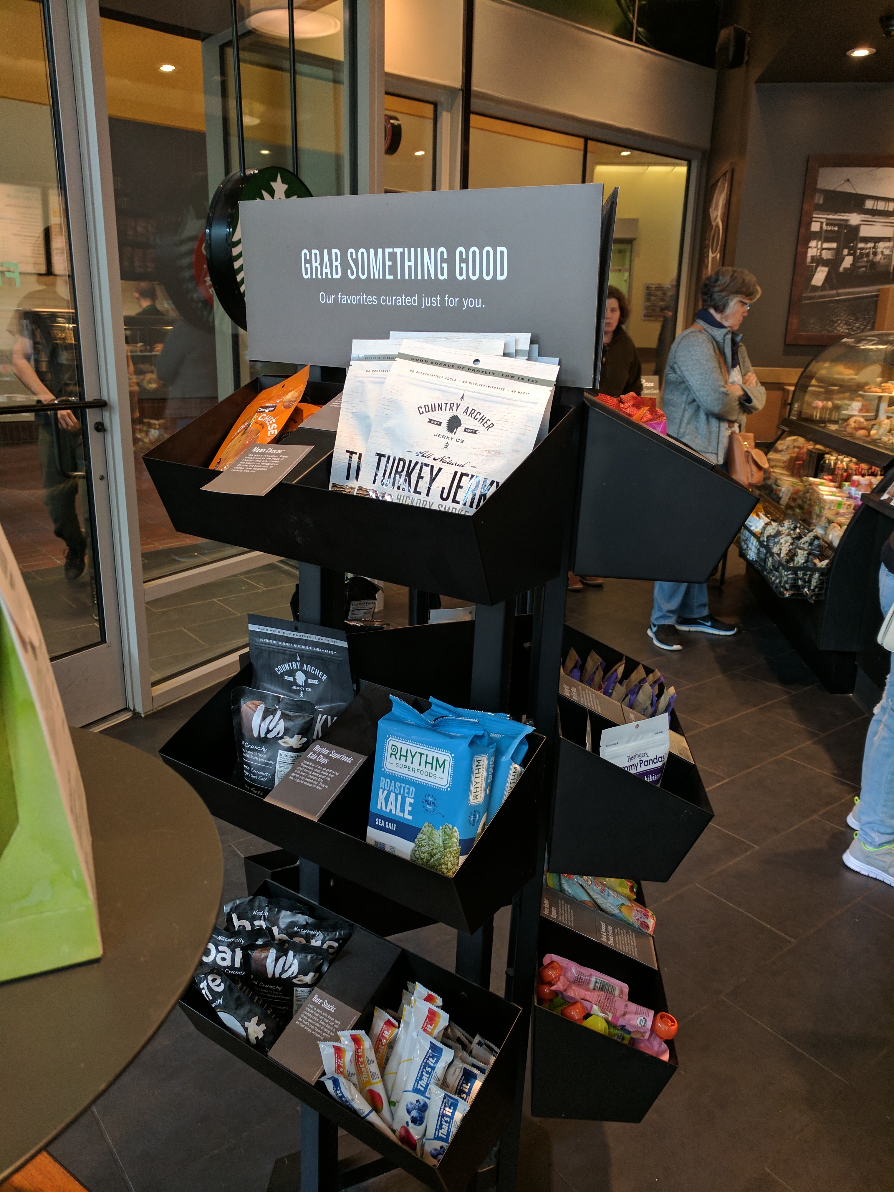
Check out this display, it fits the Starbucks dealing ethos, and offers a selection of high quality unique brands which have distinct healthy overtones. Turkey Jerky and Roasted Kale… Need I say more?
It accomplished this with a minimal amount of floor space, a sturdy design, and an eye and heart catching message at the top.
Grab and Go, done like this, is as much a service as it is a sales boost. That is grab and go done right in my book.
