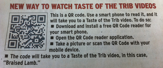
Qr codes get a lot of talk these days, they seem to be popping up everywhere and businesses and publications are in the process of integrating them into their signage, menus, marketing materials, and other printed media. I am assuming you know what a QR codes is at this point, and won’t waste any time going over the details of what they are here.
It is easy to create, print, and share them as we know. it is not as easy to get them adopted by YOUR audience, and to do that is the only way you are going to get any return on your effort. So what do you have to do to accomplish that?
Two Parts to Driving QR code adoption in your Audience:
1) Educate Your audience about what a QR code is, what they need to read it (smartphone and app), and the fact that they need to scan/take a picture of the code to get to the content.
2) Create compelling non-print content or print content that is not possible to share on the given card/menu/sign.
In the preceding example a newspaper uses QR codes to link to video content on their webpage. There is no way for the paper to share that via their traditional print product so this is a great use of Qr codes, and with the way they explain the procedure anyone who reads the article and is interested will likely give it a try with their smartphone. Driving traffic and engagement with the newspaper’s online presence and if the content is high quality it is likely the next time the reader comes across a QR code from this newspaper they will simply scan without much prodding. Thats the idea after all.
At GuestFeed we help our clients create creative and magnetic uses of Qr Codes in their offline marketing materials. First by educating then creating content that gets people scanning.

Comments
11 responses to “Want to Use QR Codes? Two Critical Steps”
As an advertiser I think this is another great idea to get people engaged. With cluttered ads out there,people( me included) don’t want to waste their time and be distracted looking at other things rather than what we are interested in. It’s an offline- online relationship which has an off- on switch and in the end , people want to be ON with the new.
Thanks for reading, I think tools that bridge online and offline are
some of the most undervalued an overlooked marketing discoveries.
Using them correctly turns a time suck into an exponential win.
You received this message because Spiro Pappadopoulos shared it with
“Thanks to +Mark Grzyb I am inviting all of my facebook friends in this
post.
Woot.”
Accept the invitation to view the full post:
https://plus.google.com/_/notifications/ngemlink?&emid=CIjY1MDB8KkCFelI7Aodnoy9KA&path=%2F105028483738386491490%2Fposts%2FeC13sDZkrJV%3Fgpinv%3DAGXbFGxFgFmG5upElPQ4dV-QFBVd13YwyolWwUw-dSMmbWTRMnlcUHIxrSLkcUpVxz8q3c18I93maff9FcBCfb1UitwjHEPKe38oqxNIS6PpQZAGlCtiB_g%26hl%3Den_US
The Google+ project is currently working out all the kinks with a small
group of testers. If you’re not able to access Google+, please check back
again soon. Learn more:
https://plus.google.com/_/notifications/ngemlink?&emid=CIjY1MDB8KkCFelI7Aodnoy9KA&path=%2Fwelcome%3Fgpinv%3DAGXbFGxFgFmG5upElPQ4dV-QFBVd13YwyolWwUw-dSMmbWTRMnlcUHIxrSLkcUpVxz8q3c18I93maff9FcBCfb1UitwjHEPKe38oqxNIS6PpQZAGlCtiB_g%26hl%3Den_US
————————
You received this message because Spiro Pappadopoulos shared it with
Click here to unsubscribe from these
emails:
https://plus.google.com/_/notifications/ngemlink?&emid=CIjY1MDB8KkCFelI7Aodnoy9KA&path=%2Fnonplus%2Femailsettings%3Fgpinv%3DAGXbFGxFgFmG5upElPQ4dV-QFBVd13YwyolWwUw-dSMmbWTRMnlcUHIxrSLkcUpVxz8q3c18I93maff9FcBCfb1UitwjHEPKe38oqxNIS6PpQZAGlCtiB_g%26est%3DADH5u8VHYbHGuI4J9QANCE_g5vXVp_vkXYtkAHmEUNGPr_JXMPOtV4cz35VX_pBCkKbcXu2u_Pn3QwaEn4rnhHqFnZnx4jq0zodZZWD2nauAwVtCq6T9Bng9B_1qUjp1GalVw2S0GOi60ePSfX2UkRQaUlXplY59ag%26hl%3Den_US
Spiro Pappadopoulos shared a post with you on Google+. Google+ makes sharing on the web more like sharing in real life. Learn more: http://www.google.com/+/learnmore/
You received this message because Spiro Pappadopoulos shared it with
“Three Shifts You Have to Make”
Accept the invitation to view the full post: https://plus.google.com/_/notifications/emlink?emrecipient=114065379906396678424&emid=CKi3zpOPm60CFdNFNAod_hMAAA&path=%2F105028483738386491490%2Fposts%2FdYqyGqeZNCR%3Fgpinv%3DAMIXal-TM–SOC_ND5cE1cmLGP6ms-XGpV2G9BHSTw-SIPUwLv1Uqqqj3z-S2roBUa7V5KEMaFVJJC4VpJaEk0cNKrY7xD2lSFeVkw9npDBqr4avuJ5Nnkw%26hl%3Den_US&dt=1324743780442
————————
You received this message because Spiro Pappadopoulos shared it with Click here to unsubscribe from these
emails: https://plus.google.com/_/notifications/emlink?emrecipient=114065379906396678424&emid=CKi3zpOPm60CFdNFNAod_hMAAA&path=%2F_%2Fnonplus%2Femailsettings%3Fgpinv%3DAMIXal-TM–SOC_ND5cE1cmLGP6ms-XGpV2G9BHSTw-SIPUwLv1Uqqqj3z-S2roBUa7V5KEMaFVJJC4VpJaEk0cNKrY7xD2lSFeVkw9npDBqr4avuJ5Nnkw%26est%3DADH5u8UQP0yYxqBmyNB5XZF3i097MMDsmR_bkRnTnbXPh2j6F461mL5u40sZyxkftCqnN_1MaItc5xg44RgngswIdqZSETQZnszx7CosqlUmJiYV1iaw4zu1PXJUiBd4Nw8AwgtfEWs0LdXMCgP-scZtS28sfZByoQ%26hl%3Den_US&dt=1324743780442
Spiro Pappadopoulos shared a post with you on Google+. Google+ makes sharing on the web more like sharing in real life. Learn more: http://www.google.com/+/learnmore/
You received this message because Spiro Pappadopoulos shared it with
“Have you seen this video of the crying green bay packer fan yet?”
Accept the invitation to view the full post: https://plus.google.com/_/notifications/emlink?emrecipient=114065379906396678424&emid=CMDPkrHj160CFcaF3godPHUAAA&path=%2F105028483738386491490%2Fposts%2FHpkDv4BKDs6%3Fgpinv%3DAMIXal_y_DbCXGJl75dMhE-pHSgekqyqGRyM4uCSwOSvVRbA5Fjm_jHr4FWqX8-AmlhYbQk8g94lkAnl9u5OmOLlWjXt30EKkcIG8bDuChrbdPsN37xn2lU%26hl%3Den_US&dt=1326827975261
————————
You received this message because Spiro Pappadopoulos shared it with Click here to unsubscribe from these
emails: https://plus.google.com/_/notifications/emlink?emrecipient=114065379906396678424&emid=CMDPkrHj160CFcaF3godPHUAAA&path=%2F_%2Fnonplus%2Femailsettings%3Fgpinv%3DAMIXal_y_DbCXGJl75dMhE-pHSgekqyqGRyM4uCSwOSvVRbA5Fjm_jHr4FWqX8-AmlhYbQk8g94lkAnl9u5OmOLlWjXt30EKkcIG8bDuChrbdPsN37xn2lU%26est%3DADH5u8U26LKayuPGnjM1z9mrab-nIVfshEPYu8lbujWXMPWcmhn58VeQSkhBD2Nq8XbydXmMQ2FVF5L84AlZPdhSWuKWUHxUSlaBuxeIHjCFLEnzHE2per-lu3dPyELH7hWpAA0Fk7SeayVNS35PDvvWWJ12xElK2g%26hl%3Den_US&dt=1326827975261
Great post. I think QR codes are cool and very useful in specific situations. However, working with clients we discovered places where the goal was to connect offline and online content but QR codes were not the best fit. So we created O-Codes (www.ocodes.com), which are simple text-based codes that can be used inline in existing print content (highlighting a product in the middle of a paragraph of text, for instance), on billboards and other outdoor advertising where it would be hard to scan a QR code, and on radio or in presentations. Since all phones can text, O-Codes are the simplest method for people to interact with offline content across a variety of settings. And, the advertiser has the one final advantage of capturing the mobile numbers of people who text, so they can follow up with them with special offers, event reminders, incentives, etc. QR codes don’t give this capability to the advertiser unless the advertiser provides the scanning application as well.
Sorry Dave, but “O-codes” are boring.
I agree – Absolutely nothing “sexy” about O-codes … o-codes. “Imma show her my O-CODE face ….O … O …. O”
Got a pic of that face? Could drive traffic for me. 🙂
There’s something alluring, maybe seductive is a better word, about the look of a QR code. Like this one, for instance.
Here is an example of a great, creative custom QR campaign. http://www.dotsinabox.com/main/school_of_rock.html